We identified Bootstrap as the best way to allow us to produce fully responsive websites.
Update our site templates
With a bit of trial and error we successfully referenced the bootstrap libraries from the page templates within the Oracle Portal CMS. We were able to build a demo site and start getting to grips with the tool to build responsive webpages.
Develop modular page layouts
Once we had got to grips with the naming conventions in Bootstrap we started developing some basic page layouts.
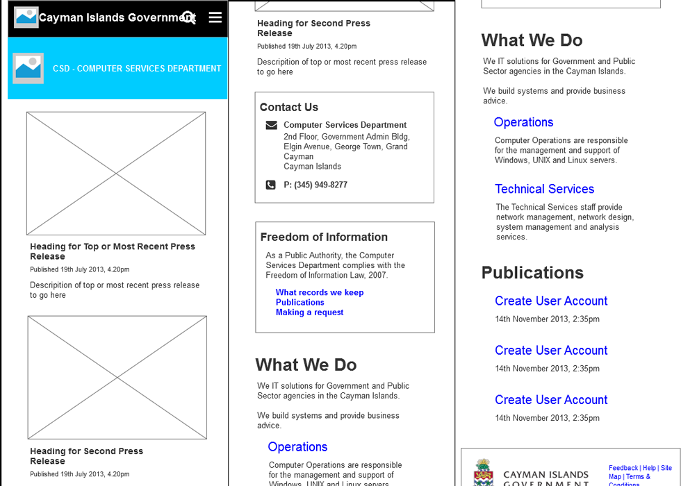
On Mobile First I produced some desktop wireframes in Axure and added mobile views. Not mobile first, more ‘mobile very early on’. I then worked on both in parallel in Axure, and added in intermediate layouts. I had four views of each wireframe, mobile phone portrait and landscape, tablet portrait and desktop/tablet landscape
At this stage I did a fair bit of work within Axure, sketching out some basic pages, and working with the rest of the team to quickly build prototypes using our CMS in our development environment.
We iterated a few times, learning more about bootstrap, building some pages and testing on our mobiles devices.
Develop common components
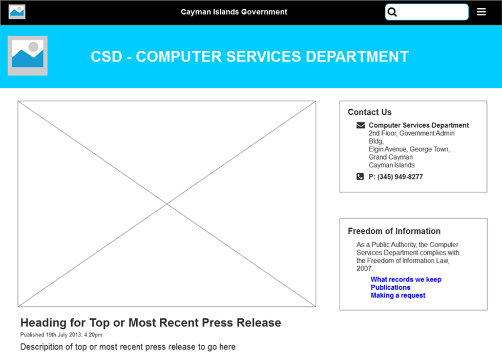
At this point we had a working page that rendered nicely in multiple devices in both portrait and landscape orientation. It included a header and footer, and some initial page components to display contact details and recent press releases.
Page Components
In Oracle Portal, content is added as an ‘Item Type’. These allow content of varying forms – text, HTML, documents, images etc to be added to a site using an online wizard. The content is stored in a database along with associated metadata. When added to a page they are wrapped in some custom html.
We developed new versions of our page components that were wrapped in Bootstrap compliant HTML. We also developed summary and reporting components to display multiple items, again wrapped in Bootstrap compliant HTML.
Pattern Library We added all new components to a demo site so we could easily review them as we worked. This allowed us to work faster, and maintain consistency
As we developed more sites using the framework, we needed to build some different components.
- We confirmed that a new component was required
- We reviewed our other sites and came up with requirements that might work on multiple sites
- We reviewed the visual design of our existing work and made new components consistent
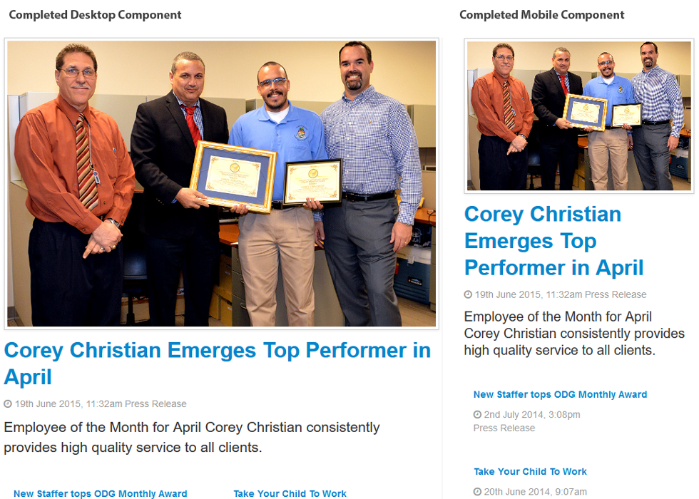
Test on mobile devices
We utilised online tools too emulate certain mobile devices, but nothing beats testing on real devices. All of our new work would be tested on whichever devices were available. Obviously throughout the team we had a selection of mobile devices and tablets to use for testing. Also we asked any visitor to the team about their mobile devices to see if we could do some quick testing on a new platform.